UI System / Component Library
A reusable UI system with components, variants, and state-driven UI.
ReactTypeScriptDesign SystemUIComponents
Project Goal
The goal of this project was to explore how to build a scalable UI system using reusable components, consistent patterns, and state-driven interactions.
Key Features
- Reusable Button, Input, Card, and Modal components
- Component variants for size, style, and states
- State-driven UI interactions
- Chat demo showing real-world component usage
- Interactive playground for testing UI behavior
- Consistent styling with Tailwind CSS
Snapshots

Overview of the UI system homepage and component structure.
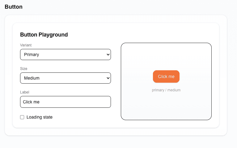
Interactive playground where button variants and states are tested.
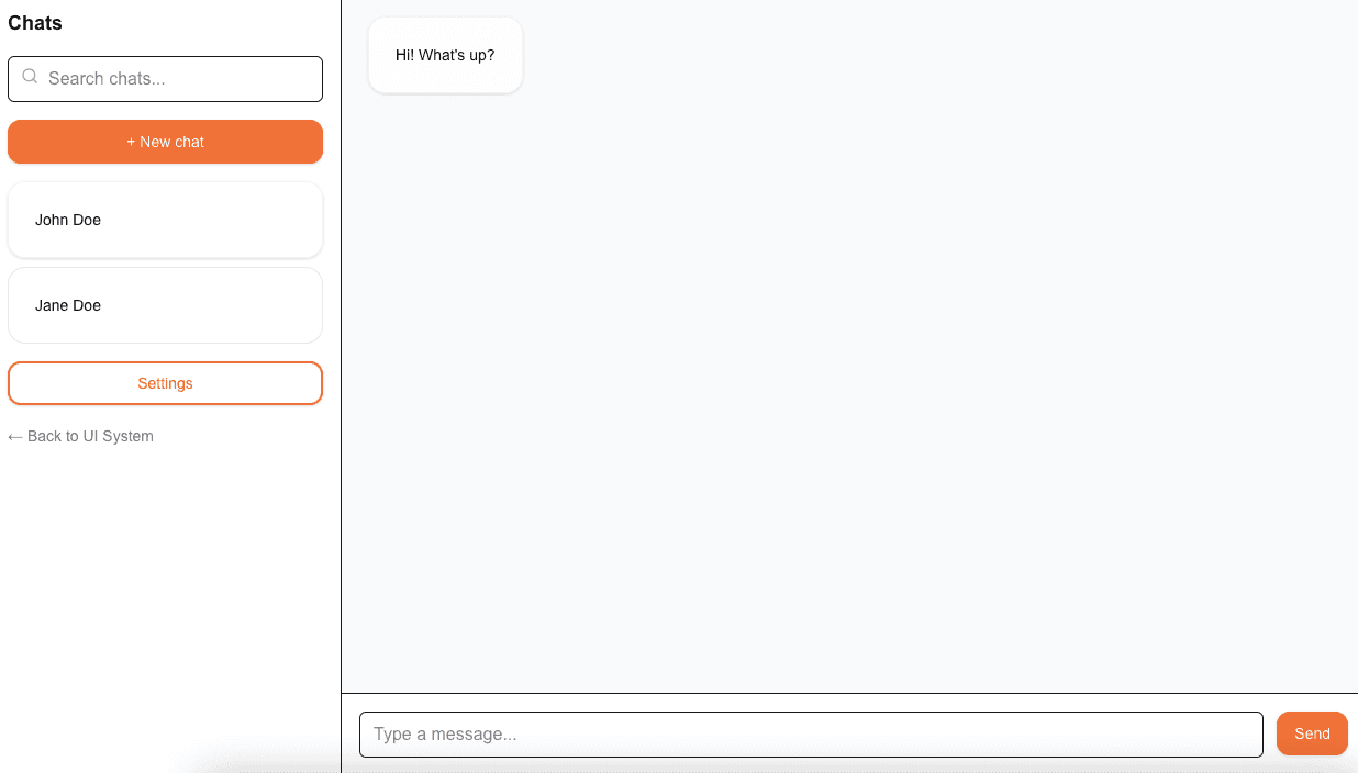
Chat demo showing real-world usage of components in an app context.
Role & Learning
I built this project independently to deepen my understanding of component architecture and design systems. It strengthened my ability to create reusable UI patterns, manage component state, and design scalable frontend structures.